The Pareto distribution (created by Vilfredo Pareto) is known as the Pareto chart or the 80-20 curve. It is a method to separate relevant values from those that are not important.
It is usually defined by these principles:
● 80% of success comes from 20% of your effort.
● 80% of your income comes from 20% of your effort.
● 80% of the revenue is generated by 20% of the customers.
● 80% of the sales are generated by 20% of the products.
To calculate this type of analysis with DAX, we need to follow these steps in which we will calculate the Pareto distribution for vehicle brands (for this, we will use the Sales and Vehicles Dataset):
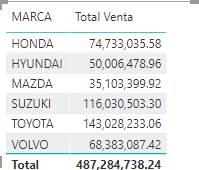
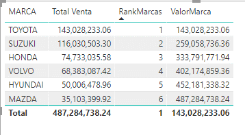
We start with a base table where we have the total sales by brand.
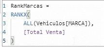
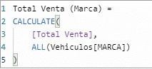
We add a new measure with the following DAX expression.
We add it to the table, and it will allow us to visualize the position of each of our values.
Now we need to calculate the cumulative value in descending order, according to the highest sales value. However, remember that in DAX there is no concept of a row; therefore, we will have to take a different approach.
The following formula will allow us to create a kind of recursive function. It will filter all the Brand values, but only calculating the value that enters the Top, that is:
If Rank = 1 then [Total Sales] filtered by Rank 1
If Rank = 2 then [Total Sales] filtered by Rank 1 + Rank 2
If Rank = 3 then [Total Sales] filtered by Rank 1 + Rank 2 + Rank 3…
This operation will be performed for each of our rows in the category we are using.
*Note: Be careful with this type of calculation, especially the table by which it will be segmented, as it can be quite resource-intensive for the model.
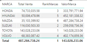
Next, we validate the formula.
If we sort by descending Rank, we can observe the expected behavior.
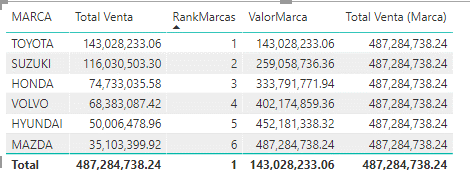
Now we need to obtain the total value of our sales; for this, we will use the CALCULATE function and the ALL modifier:
This calculation will allow us to obtain the total value for each of the brands.
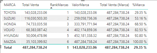
We finish with a simple division of the two calculated values.
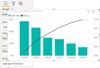
The % shown will be our Pareto; we just need to use it in one of the visualization methods (ABC, diagram, or curve):
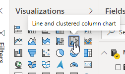
To create a Pareto chart, we can use the same table created. We just change the visualization to a clustered column chart with lines.
And configure it as follows.
With this, our Pareto chart is created using only DAX expressions.